.sidebar .widget {border-bottom: 1px solid #000000;}
Showing posts with label Photoshop in real life. Show all posts

You Break Me Up!


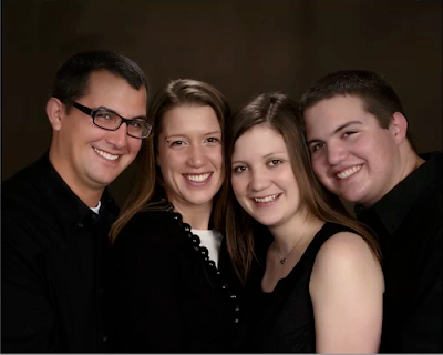
Photo of four siblings to be used as example by Photoshop teacher
Before

"After" Photo of siblings seemingly broken by following Photoshop brush video tutorial
After
Learn to "break apart" a photo by creating your own brush settings. Make photos look as if they've been torn to shreds or cut into squares.  With a little manipulating, you could even create your own puzzle.

Here is the video to get you started:  School AccessPublic Access
Here is the photo to follow along, or you may use any photo you like:  Break Apart Photo

Board Book Remake with Photoshop


We have a beautiful little girl staying with us until her mother returns from deployment.  I decided to make a board book for the baby (she is still a baby, relatively speaking) with photos of her mother.  

Here is the first stage:  Creating the Pages in Photoshop

child's board book ready to be altered by Photoshop teacher
First I found a board book at the thrift store that had seen better days.  This one, 
in fact, was destined for the trash bin at the end of the week.
Board book remake in Photoshop: Room 626 Photoshop teacher Linda Miller measuring width of book
Next I measured the dimensions. 

Board book remake in Photoshop: Room 626 Photoshop teacher Linda Miller measuring height of book
It turned out that this one was exactly
six inches square.


Creating Professional Photo Pages

Professional Photo Album spread example for Room 626 Photoshop students
Professional Photo Album 2-page spread:  New Car
Want a project that will give you some "real life" experience in Photoshop as well as allow you to choose your own subject?  Then here it is:  Professional Photo Album Design.

Photoshop Elements

Adobe Photoshop Elements box


Did you know that Adobe makes a product similar to Photoshop, but more affordable?  It's called Photoshop Elements.  It's sort of like a combination of Photoshop and Lightroom, except instead of $600, it's under $100 (in fact, Amazon just dropped the price to $82.22.)

Also, Adobe offers a pay-as-you-go program as well.  Sort of like leasing Photoshop.

Lastly, there is a free program called Gimp, which is like Photoshop but offers way, way, WAY less tools and filters and all that good stuff.  But it's good for basic photo editing.

Student Showcase: Magazines

This was a fun optional project for students to just "play with Photoshop."

Magazine designed in Photoshop by Room 626 Photoshop student
Alexandria

Put Your Face on the Cover of a Magazine!


Ever wanted to be famous and appear on the cover of a magazine?  
Here's your chance! 

Challenge: Expand your skills!


In Photoshop 2nd semester this week, students will work on the Text Portrait Project.  I have set aside the entire week for this project, because of the level of difficulty and the number of videos that accompany it.  If you follow along with the videos using your own image, your success rate will be much higher than if you try to wing it.  This is true of all our assignments, but this one in particular is a little tricky. To see examples, go to this link:  Text Portraits

My Hardest Project to date

Taking 4 different photos and creating a family photo.  I was only able to do this because all the photos were taken in the same light.  The blond boy in the finished photo is actually pieced together using parts of him from several different photos--one of his arms is actually his brother's, lol.

All in all, not a bad day's work, even though it took several days to finish.


Finding Don

So I finally decided on a Don, and started creating the parts in Photoshop.  Here are a few screenshots.

All paths drawn and inked in.

Deciding on the design

Having finally decided on my subject, I did a few searches and came up with some possibilities:
A.  Using a sillouette would make the job infinitely easier, and I like the middle and lower ones.


B.  This one actually uses one from the previous pic, but adds a nice background that would be easy to recreate.

What I did (and what I'm still doing) over the summer

This summer I had on my list two major projects:
tile front porch and
create a kitchen cart out of a bunch of junk.

Ladybug


Ladybug, originally uploaded by lcmiller461.

An example of the power of the macro lens combined with Photoshop!

Fwd: Painting Cloth and Hair in Photoshop - Tutorials - Mystical Modality

I love this technique because I love the smudge tool - one very underused tool in my opinion. I used this technique to smooth out fabric and create folds on a photo where the subject's white dress didn't flow correctly. But one day I'll experiment making these cool wings. :)

Subject: Painting Cloth and Hair in Photoshop - Tutorials - Mystical Modality

Red faced!

I have been working with photos for the Arc of the Hill Country site, and many of them have lighting issues. Some of the issues just can't be fixed--like a large light overhead casting a terrible glare. The problem with glares is that they create an absence of color and texture, so there's not really anything underneath to work with. The other problem has been a red tint to the skin of many of the subjects. I finally found this workaround, using a hue/saturation adjustment layer:
First, copy the layer (ctrl J), then...

1. Open a hue/sat adjustment layer, and select "reds."
2. Take the left eyedropper and click over the deepest red that needs to be fixed.
3. Next, take the eyedropper on the right ( - ), and click the skin tone you'd like to match.
4. Move the hue slider all the way to the left. The image will turn into magenta/blue one. Don´t worry.
**Now, look at the gray area between the two rainbow bars. There are two tiny tics within this area. Grab the tic on the right and move it to the left until only the area you want to fix has that magenta/blue stuff going on. It's okay if areas beyond the subject are selected--you will be erasing those later.

5. Move the hue slider to the right, beyond the original position until you reach your desired skin tone.

6. Now, merge the adjustment layer with the layer below.
7. Use your eraser, set with a hardness of about 50%, and erase the areas that you didn't want changed--for instance, someone's red shirt, or shoes, etc. Sometimes there will be nothing to erase...
8. Finally, merge down one more time, and you're done!

Enhancing Photos

I really love this photo of my son Mikey, but I hated the background (the original had power lines - I forgot to save a copy of the original [my bad])

Even after I removed the power lines, the sky is completely white, and the billboard is distracting. The image of Mikey also needs some sharpening and a blast of contrast.

The final version has
1 - a sky inserted into the background,
2 - the billboard removed, some of the trees replaced, (stamp tool)
3 - sharpening (Filter / Sharpening / Unsharp Mask)
4 - Auto Contrast (under the Image menu)
5 - This softening trick:
After merging all the layers, I copied that layer and applied a Gaussian blur of about 20 pixels, then changed the layer state to overlay. After that, just to take the saturation down a notch, I created a Hue/Saturation layer, and applied a Hue of +3 and lowered the Saturation to -3.
Here's the final version:

I also took out the other player. I haven't decided if I'm going to leave the sign in or not. What do you think? Reply with your opinion and get extra credit--but you have to tell my why I should or should not leave it in.

Morgan's Wonderland

I took this photo of one of the students at Morgan's Wonderland.
It was a good photo, but I wanted to make it a great photo.


The first thing I did was brighten his teeth, then I used the liquify filter to tip the corners of his mouth into more of a smile. (Note: I will be changing this back to the original because I don't like the way it changes his overall facial features. Just because you can do something doesn't mean you should...)
I also used the healing tools to clear up some patchy areas.


Next I took out some of the background; the guy in the red shirt was also in the reflection, so I took that out as well. I used mostly the stamp tool for this.


Next I used the sharpen tool to create a brighter effect on the water.


Last, I added the reflection of the student.