.sidebar .widget {border-bottom: 1px solid #000000;}

Check out the Arc site!

Go to www.arcofthehillcountry.org and check out the About The Arc
page

Sent from my iPhone

Red faced!

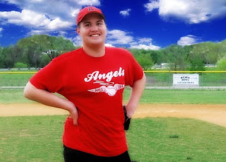
I have been working with photos for the Arc of the Hill Country site, and many of them have lighting issues. Some of the issues just can't be fixed--like a large light overhead casting a terrible glare. The problem with glares is that they create an absence of color and texture, so there's not really anything underneath to work with. The other problem has been a red tint to the skin of many of the subjects. I finally found this workaround, using a hue/saturation adjustment layer:
First, copy the layer (ctrl J), then...

1. Open a hue/sat adjustment layer, and select "reds."
2. Take the left eyedropper and click over the deepest red that needs to be fixed.
3. Next, take the eyedropper on the right ( - ), and click the skin tone you'd like to match.
4. Move the hue slider all the way to the left. The image will turn into magenta/blue one. Don´t worry.
**Now, look at the gray area between the two rainbow bars. There are two tiny tics within this area. Grab the tic on the right and move it to the left until only the area you want to fix has that magenta/blue stuff going on. It's okay if areas beyond the subject are selected--you will be erasing those later.

5. Move the hue slider to the right, beyond the original position until you reach your desired skin tone.

6. Now, merge the adjustment layer with the layer below.
7. Use your eraser, set with a hardness of about 50%, and erase the areas that you didn't want changed--for instance, someone's red shirt, or shoes, etc. Sometimes there will be nothing to erase...
8. Finally, merge down one more time, and you're done!

Congratulations!!!

Congratulations to the winners of the self portrait:
1st Place: Nicole H.
2nd Place: Samantha D.
3rd Place: Reagan I.

Also, congratulations to Shannon S., whose design was chosen for the Arc of the Hill Country website.

Great job everyone!


Enhancing Photos

I really love this photo of my son Mikey, but I hated the background (the original had power lines - I forgot to save a copy of the original [my bad])

Even after I removed the power lines, the sky is completely white, and the billboard is distracting. The image of Mikey also needs some sharpening and a blast of contrast.

The final version has
1 - a sky inserted into the background,
2 - the billboard removed, some of the trees replaced, (stamp tool)
3 - sharpening (Filter / Sharpening / Unsharp Mask)
4 - Auto Contrast (under the Image menu)
5 - This softening trick:
After merging all the layers, I copied that layer and applied a Gaussian blur of about 20 pixels, then changed the layer state to overlay. After that, just to take the saturation down a notch, I created a Hue/Saturation layer, and applied a Hue of +3 and lowered the Saturation to -3.
Here's the final version:

I also took out the other player. I haven't decided if I'm going to leave the sign in or not. What do you think? Reply with your opinion and get extra credit--but you have to tell my why I should or should not leave it in.